When you are building a custom template for a control, you could do so with nothing but C# code. Using this approach, you would be adding data to a ControlTemplate object and then assigning it to a control’s Template property. Most of the time, however, you will define the look and feel of a ControlTemplate using XAML, and to help in the endeavor, you will typically want to use Expression Blend to do so. You will use Expression Blend for this very thing in the final example of this chapter, but for now, you will build a simple template using Visual Studio 2010. Although this IDE does not include as many template design tools as Expression Blend, using Visual Studio 2010 is a good way to learn the nuts and bolts of template construction.
Create a brand new WPF Application named ButtonTemplate. For this project, you are more interested in the mechanics of creating and using templates, so the markup for this main window is very simple:
<Window x:Class="ButtonTemplate.MainWindow"
    xmlns="http://schemas.microsoft.com/winfx/2006/xaml/presentation"
    xmlns:x="http://schemas.microsoft.com/winfx/2006/xaml"
    Title="Fun with Templates" Height="350" Width="525">
    <StackPanel>
        <Button x:Name="myButton" Width="100" Height="100"
            Click="myButton_Click"/>
    </StackPanel>
</Window>
In the Click event handler, simply display a message box (via MessageBox.Show()) which displays a message confirming the clicking of the control. Remember, when you build custom templates, the behavior of the control is constant but the look may vary.
Currently, this Button is rendered using the default template, which, as the last example illustrated, is a BAML resource within a given WPF assembly. When you wish to define your own template, you are essentially replacing this default visual tree with your own creation. To begin, update the definition of the <Button> element to specify a new template using property element syntax. This template will give the control a round appearance:
<Button x:Name="myButton" Width="100" Height="100"
        Click="myButton_Click">
    <Button.Template>
        <ControlTemplate>
            <Grid x:Name="controlLayout">
                <Ellipse x:Name="buttonSurface" Fill = "LightBlue"/>
                <Label x:Name="buttonCaption" VerticalAlignment = "Center"
                    HorizontalAlignment = "Center"
                    FontWeight = "Bold" FontSize = "20" Content = "OK!"/>
            </Grid>
        </ControlTemplate>
    </Button.Template>
</Button>
Here, you have defined a template which consists of a named Grid control containing a named Ellipse and a Label. Because your Grid has no defined rows or columns, each child stacks on top of the previous control, allowing you to have centering of content. Now, if you run your application, you will notice that the Click event will only fire when the mouse cursor is within the bounds of the Ellipse (i.e. not in the corners around the edges of the ellipse)! This is a great feature of the WPF template architecture: you do not need to recalculate hit-testing, bounds checking, or any other low level detail. So, if your template used a Polygon object to render some oddball geometry, you can rest assured that the mouse hit testing details are relative to the shape of the control, not the larger bounding rectangle.
Currently, your template is embedded to a specific Button control, which limits your reuse options. Ideally, you would place your template into a resource dictionary, so you can reuse your round button template between projects, or at minimum, move it into the application resource container for reuse within this project. Let’s move the local Button resource to the application level using Visual Studio 2010. First, locate the Template property for your Button in the Properties editor. Now, click on the small black diamond icon and select “Extract Value to Resource…” (see Figure 31-11).
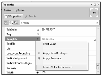
Figure 31-11 Extracting a local resource
From the resulting dialog box, define a new template named RoundButtonTemplate, which is stored in App.xaml (Figure 31-12).
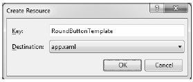
Figure 31-12 Placing your resource into App.xaml
At this point, you will find the following data in your Application object’s markup:
<Application x:Class="ButtonTemplate.App"
    xmlns="http://schemas.microsoft.com/winfx/2006/xaml/presentation"
    xmlns:x="http://schemas.microsoft.com/winfx/2006/xaml"
    StartupUri="MainWindow.xaml">
        <Application.Resources>
        <ControlTemplate x:Key="RoundButtonTemplate">
            <Grid x:Name="controlLayout">
                <Ellipse x:Name="buttonSurface" Fill = "LightBlue"/>
                <Label x:Name="buttonCaption" VerticalAlignment = "Center"
                    HorizontalAlignment = "Center"
                    FontWeight = "Bold" FontSize = "20" Content = "OK!"/>
            </Grid>
        </ControlTemplate>
    </Application.Resources>
</Application>
You may wish to constrain where this template can be applied. Like a WPF style, you can add the TargetType attribute to any <ControlTemplate>. Update the <ControlTemplate> start tag to ensure that only Button controls can use this template:
<ControlTemplate x:Key="RoundButtonTemplate" TargetType ="Button">
Now, because this resource is available for the entire application, you can define any number of round buttons. Go ahead and create two additional Button controls which use this template for testing purposes (no need to handle the Click event for these new items).
<StackPanel>
    <Button x:Name="myButton" Width="100" Height="100"
        Click="myButton_Click"
        Template="{StaticResource RoundButtonTemplate}"></Button>
    <Button x:Name="myButton2" Width="100" Height="100"
        Template="{StaticResource RoundButtonTemplate}"></Button>
    <Button x:Name="myButton3" Width="100" Height="100"
        Template="{StaticResource RoundButtonTemplate}"></Button>
</StackPanel>
When you define a custom template, all of the visual cues of the default template are removed as well. For example, the default button template contains markup which informs the control how to look when certain UI events occur, such as when it receives focus, when it is clicked with the mouse, when it is enabled (or disabled), and so on. Users are quite accustomed to these sort of visual cues, as it gives the control somewhat of a tactile response. However, your RoundButtonTemplate does not define any such markup, so the look of the control is identical regardless of the mouse activity. Ideally, your control should look slightly different when clicked (maybe via a color change or drop shadow) to let the user know the visual state has changed.
When WPF was first released, the way to add in such visual cues was to add to the template any number of triggers which would typically change values of object properties or start a storyboard animation (or both) when the trigger condition was true. By way of example, update your RoundButtonTemplate with the following markup, which will change the color of the control to blue and the Foreground color to yellow when the mouse is over the surface:
<ControlTemplate x:Key="RoundButtonTemplate" TargetType="Button" >
    <Grid x:Name="controlLayout">
        <Ellipse x:Name="buttonSurface" Fill="LightBlue" />
        <Label x:Name="buttonCaption" Content="OK!" FontSize="20" FontWeight="Bold"
            HorizontalAlignment="Center" VerticalAlignment="Center" />
    </Grid>
    <ControlTemplate.Triggers>
        <Trigger Property = "IsMouseOver" Value = "True">
            <Setter TargetName = "buttonSurface" Property = "Fill" Value = "Blue"/>
            <Setter TargetName = "buttonCaption" Property = "Foreground"
                Value = "Yellow"/>
        </Trigger>
    </ControlTemplate.Triggers>
</ControlTemplate>
If you run the program yet again, you should find the color does toggle based on whether or not the mouse is within the Ellipse area. Here is another trigger, which will shrink the size of the Grid (and therefore all child elements) when the control is pressed via the mouse. Add this to your <ControlTemplate.Triggers> collection:
<Trigger Property = "IsPressed" Value="True">
    <Setter TargetName="controlLayout"
        Property="RenderTransformOrigin" Value="0.5,0.5"/>
    <Setter TargetName="controlLayout" Property="RenderTransform">
        <Setter.Value>
            <ScaleTransform ScaleX="0.8" ScaleY="0.8"/>
        </Setter.Value>
    </Setter>
</Trigger>
At this point, you have a custom template with a few visual cues incorporated using WPF triggers. As you will see in the next (and final) example of this chapter, .NET 4.0 introduces an alternative way to incorporate visual cues using the Visual State Manager. Before you get to that point, let’s talk about the role of the {TemplateBinding} markup extension and the ContentPresenter class.
Your template can only be applied to Button controls, and therefore it would stand to reason that you could set properties on the <Button> element that will cause the template to render itself in a unique manner. For example, right now, the Fill property of the Ellipse is hard coded to be blue and the Content of the Label is always set to the string value “OK”. Of course, you might want buttons of different colors and text values, so you might try to define the following buttons in your main window:
<StackPanel>
    <Button x:Name="myButton" Width="100" Height="100"
        Background="Red" Content="Howdy!"
        Click="myButton_Click"
        Template="{StaticResource RoundButtonTemplate}" />
    <Button x:Name="myButton2" Width="100" Height="100"
        Background="LightGreen" Content="Cancel!"
        Template="{StaticResource RoundButtonTemplate}" />
    <Button x:Name="myButton3" Width="100" Height="100"
        Background="Yellow" Content="Format"
        Template="{StaticResource RoundButtonTemplate}" />
</StackPanel>
However, regardless of the fact that each Button is setting a unique Background and Content value, you still end up with three blue buttons which contain the text “OK”. The problem is that the properties of the control using the template (Button) have properties which do not match identically with the items on the template (such as the Fill property of the Ellipse). As well, although the Label does have a Content property, the value defined in the <Button> scope is not automatically routed to the internal child of the template
You can solve these issues by using the {TemplateBinding} markup extension when you build your template. This allows you to capture property settings defined by the control using your template and use them to set values in the template itself. Here is a reworked version of RoundButtonTemplate, which now uses this markup extension to map the Background property of the Button to the Fill property of the Ellipse; it also makes sure the Content of the Button is indeed passed to the Content property of the Label:
<ControlTemplate x:Key="RoundButtonTemplate" TargetType="Button">
    <Grid x:Name="controlLayout">
        <Ellipse x:Name="buttonSurface" Fill="{TemplateBinding Background}"/>
        <Label x:Name="buttonCaption" Content="{TemplateBinding Content}"
            FontSize="20" FontWeight="Bold"
            HorizontalAlignment="Center" VerticalAlignment="Center" />
    </Grid>
    <ControlTemplate.Triggers>
        ...
    </ControlTemplate.Triggers>
</ControlTemplate>
With this update, you can now create buttons of various colors and textual values (Figure 31-13).
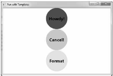
Figure 31-13 Template bindings allow values to pass through to the internal controls
When you designed your template, you used a Label to display the textual value of the control. Like the Button, the Label supports a Content property. Therefore, given your use of {TemplateBinding}, you could define a Button which contained complex content beyond that of a simple string. For example:
<Button x:Name="myButton4" Width="100" Height="100" Background="Yellow"
        Template="{StaticResource RoundButtonTemplate}">
    <Button.Content>
        <ListBox Height="50" Width="75">
            <ListBoxItem>Hello</ListBoxItem>
            <ListBoxItem>Hello</ListBoxItem>
            <ListBoxItem>Hello</ListBoxItem>
        </ListBox>
    </Button.Content>
</Button>
For this particular control, things work just as hoped. However, what if you need to pass in complex content to a template member that does not have a Content property? When you wish to define a generalized content display area in a template, you can use the ContentPresenter class as opposed to a specific type of control (Label or TextBlock). You have no need to do so for this example; however, here is some simple markup which illustrates how you could build a custom template that uses ContentPresenter to show the value of the Content property of the control using the template:
<!-- This button template will display whatever is set
    to the Content of the hosting button -->
<ControlTemplate x:Key="NewRoundButton" TargetType="Button">
    <Grid>
        <Ellipse Fill="{TemplateBinding Background}"/>
        <ContentPresenter HorizontalAlignment="Center"
            VerticalAlignment="Center"/>
    </Grid>
</ControlTemplate>
Currently, your template simply defines a basic look and feel of the Button control. However, the process of establishing the basic properties of the control (content, font size, font weight, etc.) is the responsibility of the Button itself:
<!-- Currently the Button must set basic property values, not the template -->
<Button x:Name ="myButton" Foreground ="Black" FontSize ="20" FontWeight ="Bold"
    Template ="{StaticResource RoundButtonTemplate}" Click ="myButton_Click"/>
If you wish, you could establish these values in the template. By doing so, you can effectively create a default look and feel. As you may have already realized, this is a job for WPF styles. When you build a style (to account for basic property settings), you can define a template within the style! Here is your updated application resource in the application resources in App.xaml, which has been rekeyed as RoundButtonStyle:
<!-- A style containing a template -->
<Style x:Key ="RoundButtonStyle" TargetType ="Button">
    <Setter Property ="Foreground" Value ="Black"/>
    <Setter Property ="FontSize" Value ="14"/>
    <Setter Property ="FontWeight" Value ="Bold"/>
    <Setter Property="Width" Value="100"/>
    <Setter Property="Height" Value="100"/>
    <!-- Here is the template! -->
    <Setter Property ="Template">
        <Setter.Value>
            <ControlTemplate TargetType ="Button">
                <Grid x:Name="controlLayout">
                    <Ellipse x:Name="buttonSurface" Fill="{TemplateBinding Background}"/>
                    <Label x:Name="buttonCaption" Content ="{TemplateBinding Content}"
                        HorizontalAlignment="Center" VerticalAlignment="Center" />
                </Grid>
            <ControlTemplate.Triggers>
                <Trigger Property = "IsMouseOver" Value = "True">
                    <Setter TargetName = "buttonSurface" Property = "Fill" Value = "Blue"/>
                    <Setter TargetName = "buttonCaption" Property = "Foreground" Value = "Yellow"/>
                </Trigger>
                <Trigger Property = "IsPressed" Value="True">
                    <Setter TargetName="controlLayout"
                        Property="RenderTransformOrigin" Value="0.5,0.5"/>
                    <Setter TargetName="controlLayout" Property="RenderTransform">
                        <Setter.Value>
                            <ScaleTransform ScaleX="0.8" ScaleY="0.8"/>
                        </Setter.Value>
                    </Setter>
                </Trigger>
            </ControlTemplate.Triggers>
        </ControlTemplate>
    </Setter.Value>
</Setter>
</Style>
With this update, you can now create button controls by setting the Style property as so:
<Button x:Name="myButton" Background="Red" Content="Howdy!"
    Click="myButton_Click" Style="{StaticResource RoundButtonStyle}"/>
While the rendering and behavior of the button is identical, the benefit of nesting templates within styles is that you are able to provide a canned set of values for common properties.
That wraps up your look at how to use Visual Studio 2010 to build custom templates for a control. However, before you conclude this chapter and move onto the world of web development using ASP.NET, you will look at how Expression Blend can be used to not only generate control templates but to create custom s.
Source Code The ButtonTemplate project can be found under the Chapter 31 subdirectory.